After Mistley Movies came a pretty concentrated spell of work for the Mistley Church Hall Centenary. Now, here's the thing. Should you search online, you may well discover something of a lack of information about Mistley Church Hall. You can try to search for The Institute, which is what it used to be known as, but you'll find similarly little information. I did, however, find this picture, courtesy of the Essex Record Office.
It's actually of the whole of Mistley Quay, including our old friend, Mistley Towers. Check out the previous post for some pretty Robert Adam designs, and swoon over the neoclassicism. Try not to whistle the Pastoral Symphony and imagine multicoloured ponies. I dare you. Anyway. In the bottom right corner, half chopped off, there is Mistley Institute, or Church Hall. Google Street-view is the only other way that I've found to get an image of the hall. Here:
View Larger Map
I should say, to stave off any danger of being beaten by the nice man who runs the hall, that it looks much better right now. It has been freshly painted and looks, dare I say it, pretty good. This is, therefore, not a fair representation. Use your imagination.
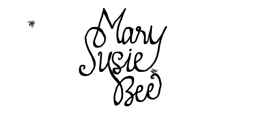
Anyway. Long story short, this year is the hundredth birthday of the hall. I was asked to do an all-events poster, and then was asked to do one specifically for the Hog Roast and Barn Dance, and the tickets for said Hog Roast and Barn Dance. I got to flex my Seven Brides for Seven Brothersian muscles. Fun.

Having no decent pictures of the hall, I pieced one together off of Google Street-View (yes, I'm that dork) and then incorporated it into my line-drawing border. It came out pretty nicely, I think. I am a sucker for a proper script font. And calligraphy. And twirly bits. I should use a more technical term, but you know what I mean.

My first attempt at this didn't come out very well at all, which was weird, given that pretty much every single one of the above elements was there. My Mum, however, gave me some sound advice, and after splitting up the text, making some bits bigger, some smaller, it came out pretty much like this. And then she told me to colour the images, and I objected, then tried it out, then reluctantly agreed. I think she might have been on the phone the whole while as well. Anyway, I was really pleased with this one. I cannot, however, take all the credit for the dancers. I adapted them from images I found which were, originally, 1950s embroidery patterns. I love these patterns. I think I may need to learn to embroider properly, just so that I can have cushions with these on. I did, however, tone down the fussiness of the girls. They originally had flowers on the dresses and bows in their hair which was all a bit too much. I also couldn't decide what colours to do their dresses, until, having decided on the boys' shirts, I then checked Seven Brides for Seven Brothers and matched the right shirts to the right dresses. Yes. I know.
Naturally, the tickets then also had to match. You can't use all those fancy fonts and then do something in Arial. That's just not on. So I did these as well:

I actually designed them to be on white, but they were printed on colour, so I thought I'd recreate them, as they were. They took a while, but I was pretty pleased with how they turned out. I really enjoy doing this kind of writing. Until I get better at it, I semi-trace a good script font, adapt and add as I go, and then go back over it to thicken some lines and neaten others. I don't really write very well on an angle, so I really need to learn better. It's much easier on paper than a graphics tablet, for some reason. Practice, however, makes perfect. Or at least, better.
On the same theme, although not entirely related to the hall centenary, I was also asked to do this:

Again, the text was a big deal for me. I also discovered that I can't draw a single brass instrument from memory. Not entirely surprising, perhaps, with French Horns and Tubas, but surely I could have just about worked out how a trumpet looks? Uh, no. Being terribly self-referential, I wanted it to look like this, which, I suppose, in turn, had been supposed to look like this. I really enjoyed this kind of line drawings, though. I had been planning it on paper, and they came out pretty similarly, which was a nice look. I don't like them to look too clean and computer-ish. That said, I was also asked to do a Harvest poster for the church notice boards by hand. To make it more interesting, they had to go outside the notice boards, as we cannot currently get into them. I merrily got on with it, made stencils, sponged on jaunty harvest colours to the exact specifications of the notice boards. It was only two minutes before finishing that I remembered that the notice board was bigger than the A3 laminator to which I had access. In fact, it was more than twice A3. I would have had to chop it up into tiny rectangles before it would fit in that laminator. I kicked a few things. I stopped harking on about how much I was enjoying doing a poster by hand. I wistfully imagined just changing the size under 'Resize' and then printing the right size. I ate my dinner in gloomy silence. Then I spent all evening cutting up my poster and sticking it back together in a size that was laminatable. I even missed most of that episode of The Great British Bake-Off. All in all, a bad night, but the poster came out pretty well. All that, and I never got a photo of it. Thank goodness I can make things look pretty hand-drawn on the computer. Never again. Never. Again.
Have a nice weekend.
No comments:
Post a Comment